UX microcopy solution 1: Pricing page
The Problem
A pricing page flow for individual plans presented a verbiage issue. The broad set of customers included small-business owners, large-company employees who obtain a license for their team, and individual users. Due to state and value-added taxes, pricing was determined by address, which could be anything from a residential home to a corporate warehouse. Stakeholders were confused as to how to label this information in a clear manner.
The Process
I collaborated with the project manager and UX designer on possible solutions. Entering an address needed to be clear, concise, and intuitive.
Before:
The field label “Business Address” could also be “Physical Address”, “Shipping Address”, or “Home Address”. Stakeholders needed to make a difficult decision for this broad set of customers.
After:
Working with the project’s dedicated UX designer, I explored possible solutions that would remove the label altogether. Successful UX strategy relies on effective simplicity, and by consolidating two sections of the account setup, the address entry became seamless.
UX microcopy solution 2: new dropdown pattern
New Dropdown Pattern:
User testing conducted by UX research identified a discoverability issue with automation setup. Users were having difficulty understanding the specific differences with automated triggers, and the established pattern of tooltip use provided a poor solution, as users weren’t opening the critical information they needed. I worked with the dedicated UX designer on a solution that persistently exposed this information in a clear, thoughtful manner. Please note that this dropdown is still a work in progress as I need to request a couple minor copy edits. This outperformed the existing patterns in every A/B test performed.
UX microcopy solution 3: Hint text
Hint Text:
The automated workflow edit modal allows users to name and describe the workflow for all users included. The standard verbiage for the description field is “Add a description (optional).” I felt that this language was robotic and not very useful. By adding hint text in a conversational manner, the modal presents its value to the user more clearly. Detailed embellishments can make significant impacts for users new to the experience, provides richer context, and directly impacts the entire product.
UX microcopy solution 4: conversational tooltip
Conversational Tooltip:
The established pattern of tooltip links that provide help article access was the standard verbiage “Learn More”. By adding a conversational tone to critical help articles, users have a deeper understanding of what the link provides and whether or not they need more explanation of this feature.
UX microcopy solution 5: conversational alerts
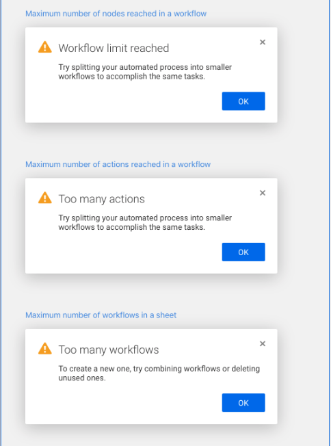
Conversational Alerts:
Modern apps use conversational methods to relay complex information. By working with the product manager and dedicated UX designer, I wrote error state messages that avoided technical jargon and established an easy-to-understand message in an impactful manner.


